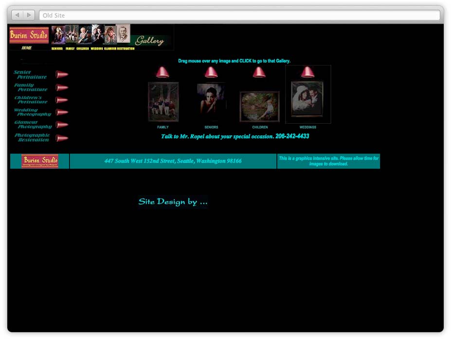
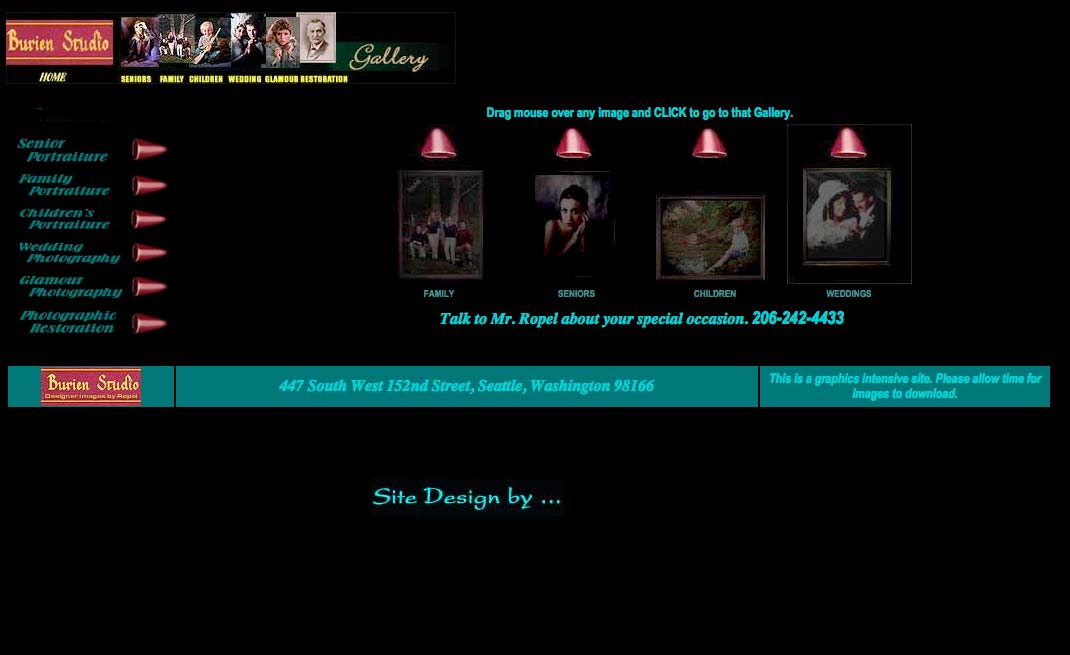
Burien Studio

About the project

Burien Studio was a photography studio located south of Seattle. The original site was extremely dated and cumbersome. I not only worked on designing and developing the site, but also rebranded the identity of the company. The company has since moved and changed logos; the images below reflect the original design.

Roles

Design
Development

Outcomes

Website
Revamped branding


Deconstructing the problem…

Outdated design

One of the most obvious problems was the design was painfully outdated. It felt like a relic of the past. The black background with teal font was dark and claustrophobic. It was uninviting to the user. In addition to the dark scheme, the multiple fonts showed a lack of focus and a poor representation to the client. The visual elements felt more at home on a 90’s Geocities site as opposed to contemporary site.

The logo mark was out of date and poorly used. In part of missing source files and lack of understanding of brand dilution, the client used multiple logos for promotional materials and in his photographs. Adding to the brand dilution was the lack of brand color representation on the website and in printed materials, - the logo is gold and red; the site is black and teal.

Bad UX

Putting the visual design aside, the site suffered from multiple pain points from a user experience point of view.

The typical scenario will find the user having to go through several pointless splash screens in order to get to the gallery of pictures. On average it takes the user 4 clicks in order to the goal. By that time the user would be discouraged.

Example scenario of user clicks:
1. Main Splash screen > 2. Gallery selection > 3. Gallery Splash screen > 4. Thumbnails


Solution

In the end the client liked the website, but decided to retain his old logo. Since then the name of the photography studio has changed due to relocation. The solution below is based upon the original design intent.

Logomark

Gone is the old design from the 1980s, in it’s place I used a simple and clean slab serif paired with an embellishment that acts as an underline and a visual divider.

The logo mark is meant to project a strong masculine image, while maintaining a designedly touch. No fuss; Classic; Modern.

Website