Office Fresh Icons

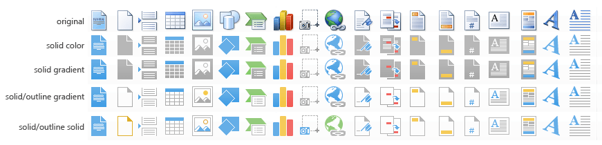
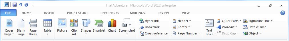
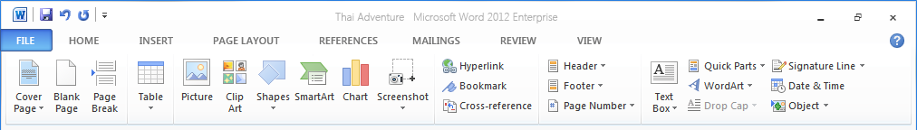
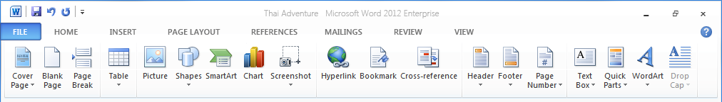
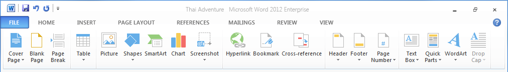
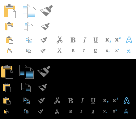
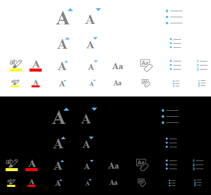
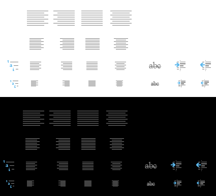
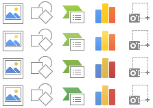
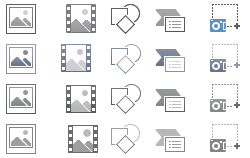
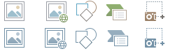
Along with the global reinvigoration of the Microsoft design philosophy, I helped develop the refreshed icon system for Office 2013. This was no small feat. Months of design exploration, countless color samples, user testing, and thousands of hours went into creating a fresh interpretation of the familiar.

Outcomes

~75,000 of deliverables
Support of 4 dpi buckets

Roles

Co-Lead
Designer
Branding
Production
Training

Timeframe

2012

Early Exploration

Retaining the general look and feel of the earlier design but flattening the colors and removing effects.

Further pushing the style by reducing the icons to their most important elements.

Style comes into focus

Early in the cycle we wanted the icons to work on both white and black backgrounds. This would allow the Office team the ability to finally create a true "black" theme, something that we were unable to do due to the lack of contrast between the icons and the background. It would also increase the accessibility for web. A desktop application will know if the user is in high contrast accessibility mode and switch out the assets; a web application doesn't have the ability to do this. So to accomplish this, we explored using a medium gray for the stroke that seemed accessible for both colors, as well as remove the background from the icons.

Also for this cycle, we included full support for high dpi devices. The icons below are the ramp of sizes for the "Home" and "Insert" tabs in Word.

Color Exploration

Color was a complicated process. We explored many paths, more than I could possible show, but in the end we settled on a flat bright but muted color palette.

Flat colors

Slight Gradient

Monochromatic

Monochromatic with a touch of color

Final

Below are Before and After examples of the change in design.