GOODesign

The GOODesign project was the accumulated course work of the School of Visual Concepts’ UX certification program. Each class added an element of the process that built up to a comprehensive interactive prototype. In my User Research class, I identified the audience and defined the problem. I brought order into the chaos in the Information Architectural class. Finally, I tested the usability through a competitor’s site, which led to high fidelity interactive prototype of a website that connects designers with non-profits.

Outcomes

Full-lifecycle UX proposal
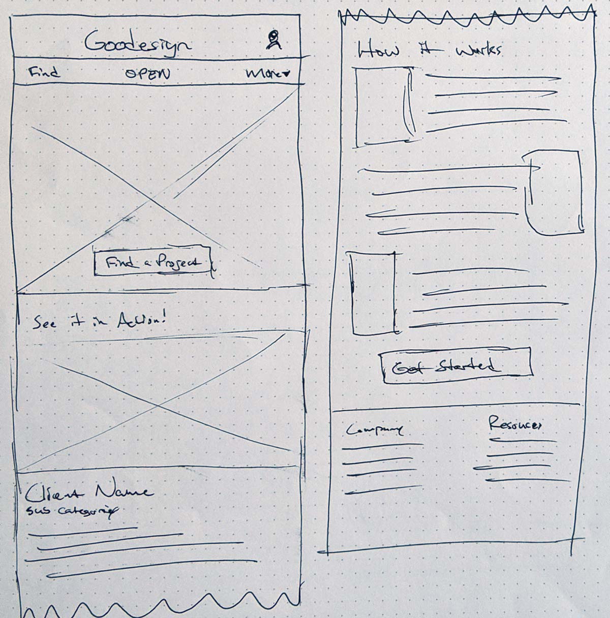
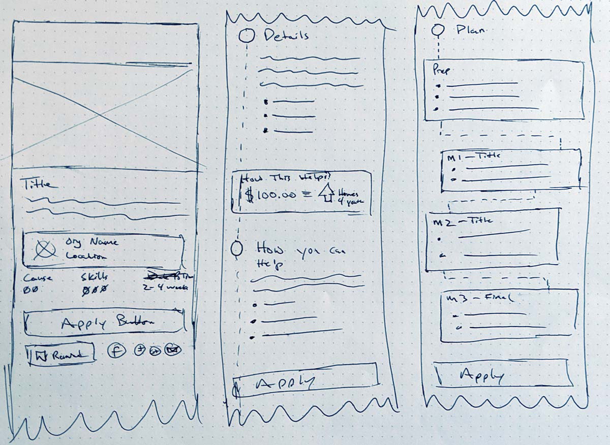
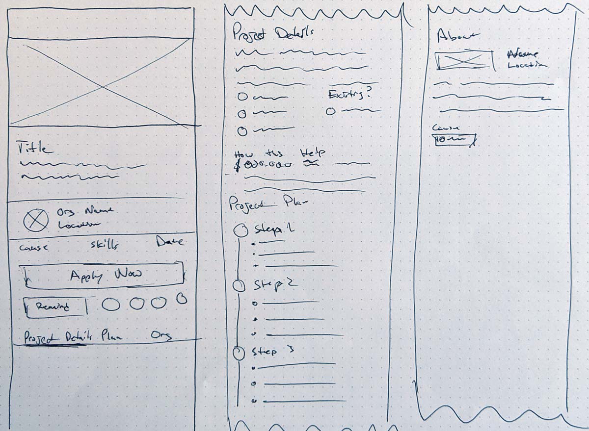
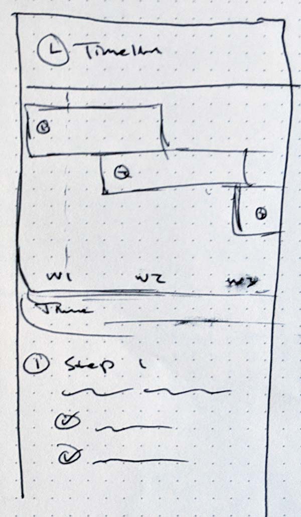
Interactive Prototype
Site Map
Insights/Recommendation

Roles

Research
Design
Prototype

Timeframe

Fall 2019 to Winter 2020

Background

About

For the first time in the program’s history, each student in my cohort was to create a product at the beginning of the program and bring along with them for each of the significant classes course work. In the past, each class’s work was siloed from the rest of the program. The work you did in the User Research had nothing to do with the Interactive Design course work. This is a change for the better; not only does it allow better connection for the students and their coursework, but it will enable a much more thorough case study, of which you are reading.

At the end of my coursework, I created a complete, full-lifecycle, responsive UX proposal for a product line of my choice. This product line had to be of the right size; not too broad but not too narrow. The ultimate purpose is to have a product that user must come back to. I ultimately created a website connecting designers with non-profit organizations.

Requirements for the proposal was:

  • Site map
  • Navigation system
  • Labeling system
  • Interface controls
  • Two sets of annotated wireframes:
    • Four for phone (mobile)
    • Four for desktop
  • Wireframes required in each set:
    • Home page
    • Category page
    • Product details page
    • Product support page

Problem/Product

…you can always build out your portfolio by doing some work for a charity or something. They always need the help…random designer providing advice

There is a chicken-egg situation when it comes to finding a job in the design field. All jobs will require some experience, and sadly real-world experience trumps academic in the eyes of an employer. This makes sense. Employers want someone who is grounded with real users, real budgets, and real consequences. But as a designer, it was frustrating to experience this catch-22 where to get experience, you need experience.

As I try to pivot my career, I’m faced with this issue again which inspired this project. One of the pieces of advice I have been given has been in the past is to volunteer to get experience. This sounds good and all, but how does one start? What do you do if you are new to town or just an introvert? I thought I could help this by creating a website that connects designers with non-profits. The site will help build up their resume and portfolio, while navigating the do's and don’ts associated with being new to the field.

Users

The site has two audiences going for it. There are the designers looking of work and the organizations looking for help. For this project I focused only on the designers. It was a group that is more reachable to me with the limited time. Based upon users interviews and research, I was able to put together a good idea of the beliefs and ideals of the user.

They are proactive in seeking out the opportunities. Volunteers are active in the community. They go to networking events and meetings.

They volunteer for subjects that are passioned about. This should surprise anyone. If someone is willing to do work for free, they will doing for something they have a connection to.

Similarly, volunteers do work that they are already skilled at. For the volunteers I talked with, they all leaned heavy on their existing background. Initially I thought volunteering would be a way to gain a new skill, but it doesn’t make sense when it’ll just create more stress.

Research

Research Goals

Research was broken into several activities and methodologies. I read a several pieces of secondary research and learned about the volunteer space. I interviewed several volunteers and learned their stories of the user. I initiated a usability test on competitor sites to learn the pitfalls in this design space.

My goals for this research:

  1. How do people who are interested in volunteering find opportunities?
  2. How do designers manage their projects?
  3. What stops people from volunteering?
  4. Do designers differentiate volunteer work from paid work?

Time to kill pro-bono?

One of the main sources of secondary research was an article by Sam Applebee. Sam is the cofounder of SuperGlobal which deals with solving social problems through technology. The article breaks down the failures often accompanied with pro-bono work.

Miscommunication creates breakdown – Clients and designers have different cultures and lexicons which will lead to mis-matched expectations.

Social Contract of Payment – Money forces commitment and implies a level of respect.

Disincentives participation Volunteering takes time and stains resources, so only the big firms can volunteer without taking a hit.

User Interviews

After completing the initial research, I wanted to learn more about the past experiences with designers that have volunteered in the past. To do that I interviewed 3 designers with various levels of success. Each interview was done in person in the Seattle area.

What I took away for this:

  • Active in networking
  • Relied on previous experience
  • Expectation! = Success!
  • Each person managed in a different way

Insights and Recommendations

Taking all the research and building an affinity map, I was able to get an overview of the data a and find the themes. From these themes, I created a series of recommendations to incorporate into the design.

Large projects can be intimidated and often the size of the project will often separate pro-bono work from paid work.

Recommendation: Emphasis small projects. Large projects should be broken into smaller deliverables

Clients are often misinformed of the lexicon and process of the design work

Recommendation: Help clients articulate their issues in a way so designers can understand each other.

Mismatched expectations for both clients and designers cause major issues.

Recommendation: Provide clear expectations on each project; along with a clear actionable timeline.

Competitor Analysis

Catchafire homepage

Catchafire is the best example of this sort of voluneteer site. Clean design with clearly defined projects; including "value".

Taproot+ homepage

Taproot+ is not a good but offers a templated base experience and helps vet both sides.

When I started the project, I was under the belief that there were no websites specific for this type of volunteer work. There was general volunteer work, but I didn’t find any relating to design work on them. Turns out I was wrong. There are several but the two that I thought did a good job was Taproot+ and Catchafire.

  • Both try to help both non-profits and volunteers articulate the needs and skills.
  • Both offer a level of vetting. Interviewing both the non-profit and volunteer offer a level of assurance.
  • Catchafire does a great job using pre-scoped project templates. This helps ensure that the projects are the right size.
  • Catchafire includes the value of the project in dollars and how they will use that savings. This goes back to Sam Applebee’s idea of the Social Contract of Payment

Usability

In my opinion, Catchafire was the more successful of the competitors at bridging the gap between the two sides. Testing the usability on the site would give me insights on user flow and structure of a similar site. I interviewed and tested seven skilled professionals with a mix of volunteer experience in the Seattle area. Using think-aloud protocol and task analysis, qualitative and quantitative data was gathered. Participants were also given a System Usability Scale questionnaire.

  • Navigation was clear and concise
    • All Participants were able to quickly jump in and find a job
    • The way the project filters work did cause some confusion
      • 5 of the 7 participants had expected the large buttons at the top to behave differently than they did.
      • The design was recently updated (March 10th) to operate more like sub-navigation. This might solve the confusion but will require further testing.
  • Detailed project page was largely positive
    • “This is actually really cool. I would actually totally do this” -P5
    • Concise description in “What was needed” and “how it helped” rated high
      • Participant used words like “awesome” and “love it” to describe
    • Adding more information such as the organization’s website or important dates can help further inform volunteers
  • Trust is a major potential roadblock.
    • “If I'm going to donate my time, I want to know their perspective on things. There is enough suspicious websites out there.” -P6

Reframing the problem

Initially at the beginning of the project, I was thought the focus was going to be on getting work for new designers. But after all the research the crux of the problem expanded and became clearer. The pitfalls that designers (and organizations) fall into isn’t so much about finding opportunities but how to communicate with each other.

My problem statement went from

Designers new to the field need help connecting with non-profits to help build up their resume and portfolio, while navigating the do's and don’ts associated with a new field.

to

A website connecting designers and non-profits with each other and help provide clear expectations and understandings so the projects can be successful.

Design

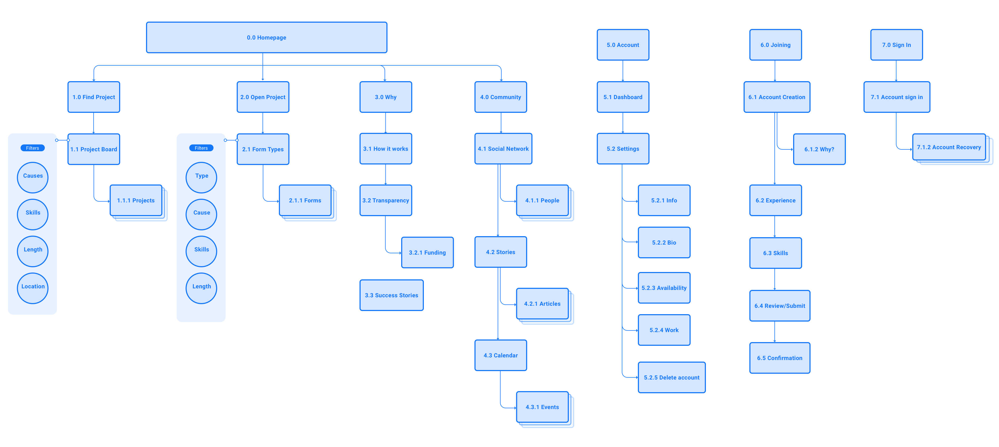
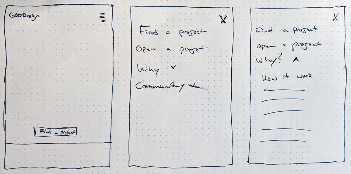
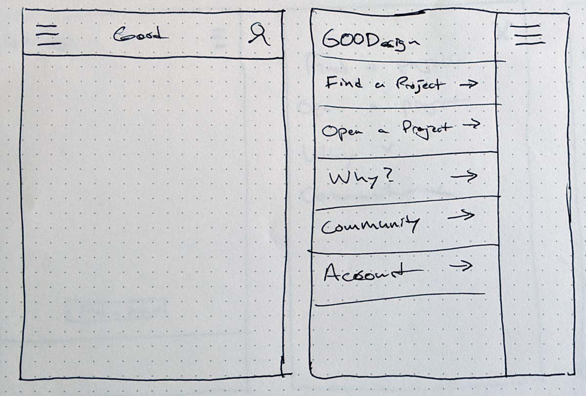
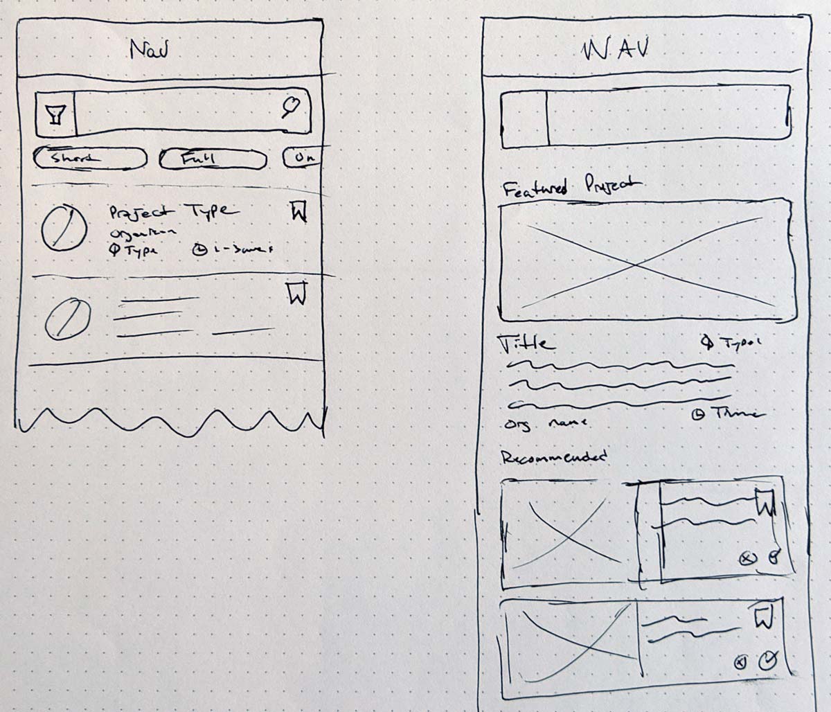
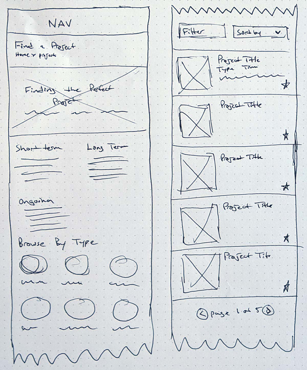
Site Map / Navigation model

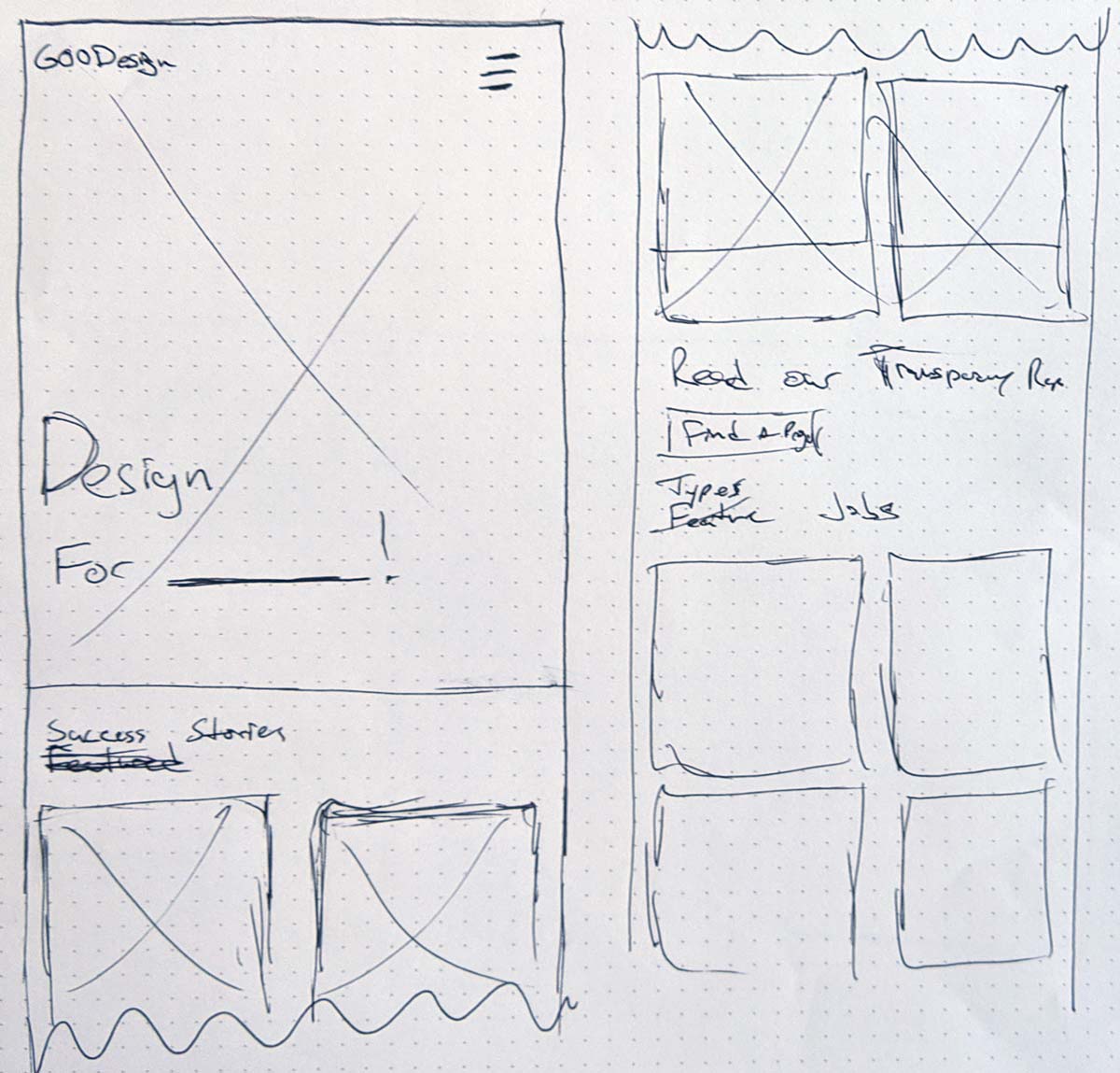
The site has two different users with unique tasks. I wanted the map to reflect the actions each will need to take. That will allow clearer user flows; designers need to find a project so they will go down that path. I then validated this model through a card sort with a small group of six designers.

GOODesign Navigation Map

Sketches

Home Page

These are two concepts that I created for the home page. Similar in content, they act differently. Concept 1 is much more straightforward with the clear call to action and breaks down of the process. Concept 2 uses the homepage more as advertising the purpose of the site. The final design combines elements from each concept. I also explored what a non-hamburger navigation might look like.

Sketch of homepage

Straightforward design gets users familiarized with the process and find them a project.

another sketch of homepage on a mobile device

People volunteer because the believe in the cause. This concept focuses on that aspect and uses it an attention grabber hero.

These quickly explore the menu interaction. The overlay menus feel more contemporary and cleaner and that is what I ultimately went with. But I did want to see what a sliding menu would look like.

Overlay Menu

Overlay Menu using large text the fills the screen

Slider Menu

Slider Menu feels a bit out of date with current design patterns

Category Page

I explored a few possible directions for the top section in the Category page. Should I use it to display a featured project or as a secondary navigation? Ultimately, I used a pared down navigation where users can click on different issues/interests.

Sketch of category page with featured project

Feature Project at the top - this could be based upon users skills/history or maybe even paid by the organizations for placement.

Sketch of category page with Issues Navigation

Secondary navigation based upon project length and issues. This felt a bit too much space.

Project Page

On these sketches, I wanted to explore some possible directions on how to show a “project plan”. This would be the milestones for each project. In addition to map of cards and linear list, I investigated trying a timeline like seen in project management software but that mental model seemed too detailed for this purpose.

map of cards sketch

Left and right cards create some visual interest and acts like a map. As the user scroll, the line fills up.

linear plan sketch

Linear Plan is straightfoward and easy to understand.

timeline cards sketch

Timeline chart based upone project management software felt too complicated for this level of overview

Note:

The site was designed to be mobile first. All sketches were done with that in mind. Moving from mobile to desktop was straightforward. The move to desktop did allow some more visual composition and layout options.

Wireframes

Home Page

Primary goal for the home page is to help market the product. Entice the consumer, help inform them, answer any immediate questions and then give them some options to move forward with.

Mobile view of the home page

Desktop View of the home page

Top half of the home page shows process and previous project.

Hero Section

The (almost) full screen image along with the hero text. The general idea is to have a underline area to denote where designers to write in what they are designing for. Since this is pro-bono work, there is usually a passion for their topic. It also starts a "design for" pattern that follow through the home page.
Ideas...
Design for Justice; Design for Them; Design for Equality

Design for Success

Explains how the site works. Break it down into 3 parts; Reach Out. Connect, and Plan.

Design for a Cause

This section will show off success stories with former and current clients.

Design for Transparency

Transparency is one of the most important parts of charitable work. Highlighting it is super important for shareholders.

Design for Good

All the titles led up to Design for Good which is a play off the name of the site. This will display to the top categories that a designer can search for.

Bottom half of the home page shows the impact report and various project categories a users can jump into.

Category Page

The category page displays and filters various open projects for designers to browse through. .

Mobile view of the category page

Desktop view of the category page

Top half of category page has all of the filters and search features

Search/Filter section

Quick add and remove filters to a search experience.

Browse by Values

Top categories/causes that designers can pick from if they don’t want to do a more robust search

Project Cards

Basic information and description for the project. Users can bookmark projects to come back later.

Recommended Project

An idea to add recommended projects that the user might be interested in. Could be based upon user account settings or tracked via previously viewed items.

Bottom half of category page contains pagination

Project Page

The project page breaks down each project into clear understandable pieces of information. The projects will need to show what is needed, how it will happen (plan), and background of the organization

Mobile view of the project page

Desktop view of the project page

Top half of project page sets the stage of what the project is about

Blurb Section

Quick description of the project at the top of the page

What... Section

All the required details on the project. What, requirements, benefit. Showing the value of the work in dollars was take away from the secodary research. It was also somethign that was done by Catchafire that rated well with users.

Interview Indicator

If a interview is required for this project, an info icon is displayed

How... Section

Biggest part of failure for these sort of projects is lack of planning. General plan is built into every project template for the org to fill out.

About... Section

What the organization is all about, including mission statement and website link

Completed Project

Seeing completed projects from the organization increases trust and connection

Bottom half of project page gets into the details of the project and the organization

Success Story Page

Success Stories act as a case study that highlights the success of the connect between the designer and organization. Also acts as a way to highlight the designer.

Mobile view of a success story

Desktop view of a success story

Top half of Success Story page introduces the project and designers

Problem Section

Outlines the problem the designer was trying to solve

Designer Section

One reason people volunteer is to network. Highlighting the designer can help getting people to volunteer.

Process Section

A short but in-depth section on the process of the project.

Success Section

Photos/quotes/details on the final product

Bottom half of Success Story page goes into the process and final product

Outcomes

Instructor Feedback

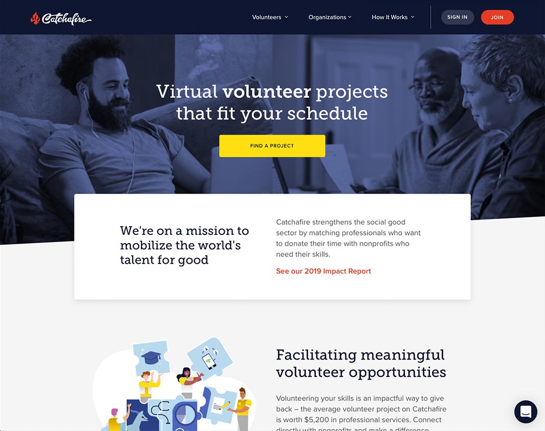
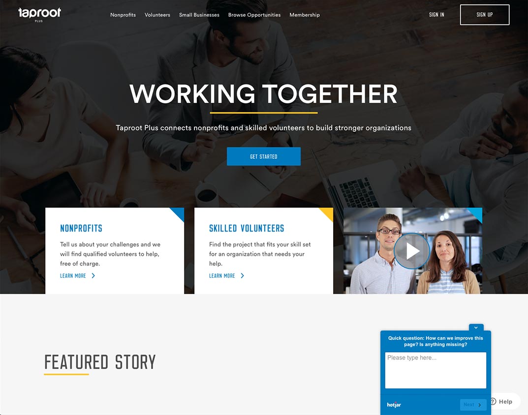
The final product was very well received by the instructor and classmates. The final design clicked pretty early so each revision was polishing up an already strong design. Obviously, I would love to test it with users to compare the experience with Catchafire or Taproot+. That is something that I would like to do moving forward.

This is remarkably thorough, thoughtful, and sophisticated work, displaying strong grasps of flow, many interface controls, layout and (imminent) visual design.Larry Sisson, IxD instructor

Reflections

Lessions learned / Next Steps

By and large, I’m pretty satisfied with the final product. I’ve always enjoyed the wireframing part of the design process. It’s a part that I’m very comfortable and think I do well. What was hard for me to do was the in-person interviewing and testing. Those are elements that are out of my comfort zone. I’m generally a shy individual so approaching people is always an uncomfortable experience. That said, once the interview started, I felt comfortable. Ultimately I will need some more experience to help break some of the discomfort.

Next Steps

  • Mood Board 2-3 directions for visuals
  • Apply Visual Direction
  • Explore micro-interaction
  • User test the "final" design to see what can be improved