I took on the task of converting all the guidelines for the Office Icon team into web site. This gave the team a single centralized location that could be easily editable. Going web gave the guidelines more richness in detail while also granting flexibility in sharing.
Outcomes
Custom SharePoint website
Central location guidance
Archive of histoical knowlege
Timeframe
2014-2015
Currently Active
Roles
Direction
Visual Design
UX Design
Writer
Production
Development
Problem
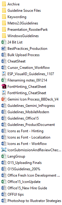
All of the various documentations created over the years.
Over the years, documentation for the team ballooned up into a dozen or so files. This proved to be an issue when it came to editing and reading them. A 100-page Word document is not a user friendly experience and lead to many partners and team member to no fully read the guidelines. It also led to multiple out of date versions being distributed.
In the end the guidelines need to be…
- Secure
- Rich in content
- Shareable
- Editable
- Searchable
Exploration
Several colleges and I brainstormed over what format the new guidelines should it be.
- Should it be a single Word Doc? — That would lead to the same issues as before.
- A OneNote Notebook? — Simple solution but lacked security.
- Website? — Other teams had one. Once set up should be simple and secure.
We went with the website
The main inspiration for many of the design elements was the site used by the UX Design team for their guidance. The thinking was that if there is some commonality between the two sites then there will already have some familiarity for the various partners.
The SharePoint issue...
Out of the box, SharePoint (site had to use SharePoint for hosting) doesn’t allow a lot of flexibility in design.
To do a truly custom site, I needed to do a lot research in a framework more aimed at developers than designers. Luckily there is a small community that is supporting modern web standards such as 12 column responsive grids for SharePoint.
One of the main issues with the UX Designers website was, ironically, the lack of usability with the main articles. The general design lacked the ability to jump from article to article. There were other minor visual issues, that I thought could be improved upon.
Final
As with all rich-content websites, the end result is never really final. It’s always evolving.
What I was able to do and create did, I believe, check all the boxes that the guidelines needed to be.
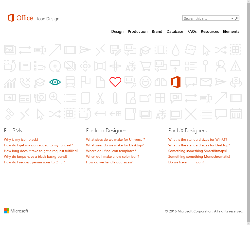
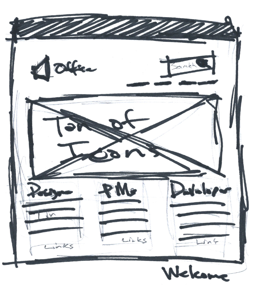
Home Page with quick links common topics
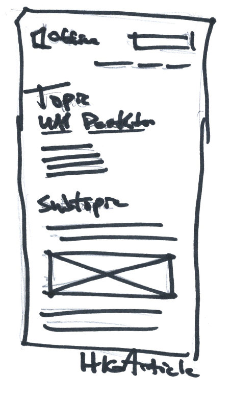
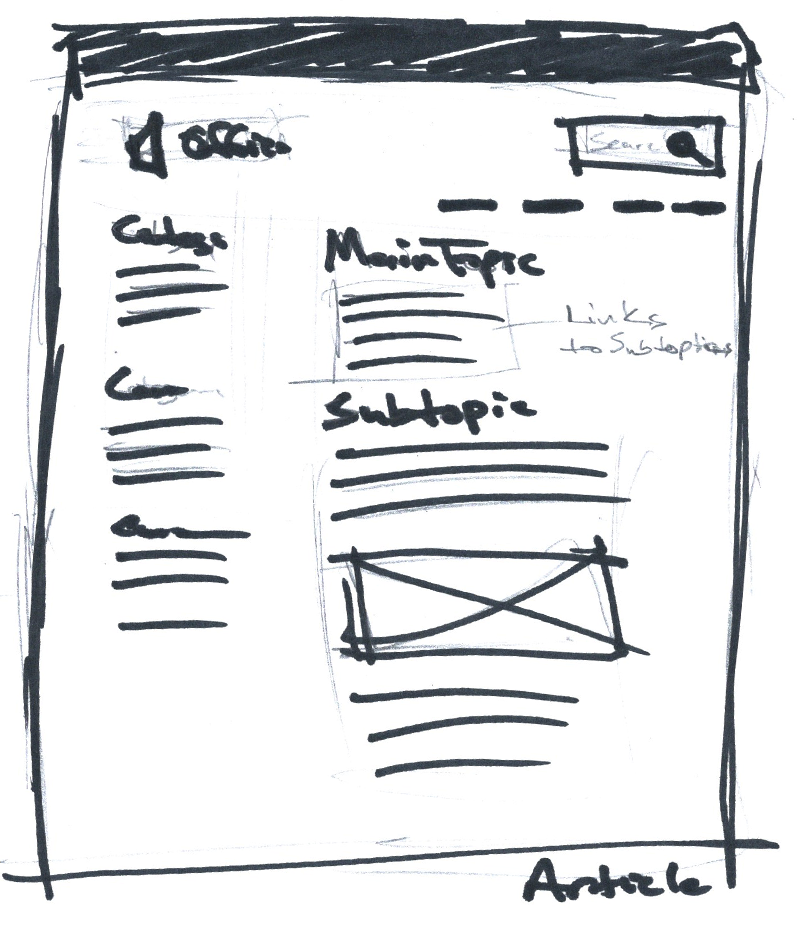
Basic Structure of the articles. Side bar with links to other topics
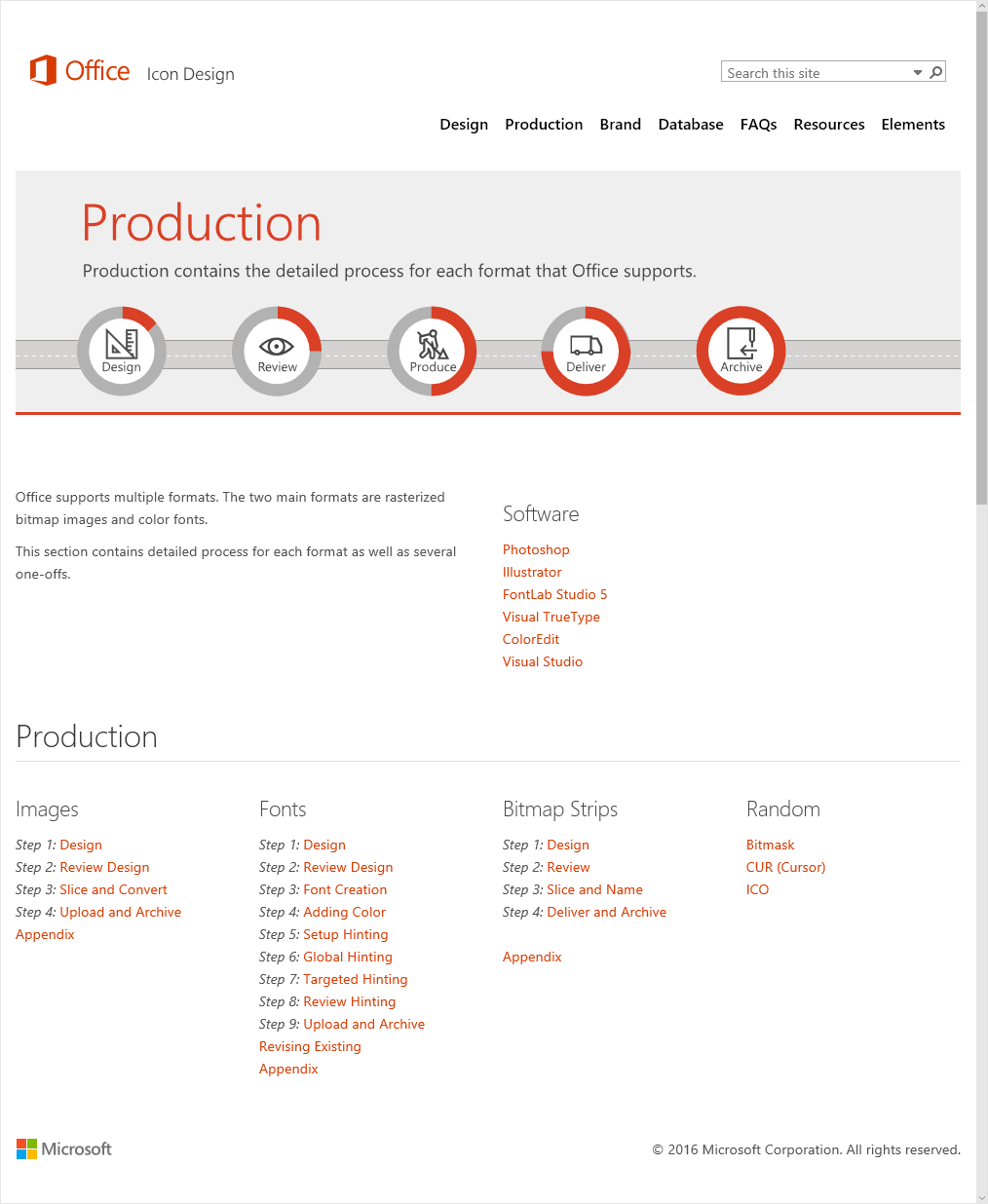
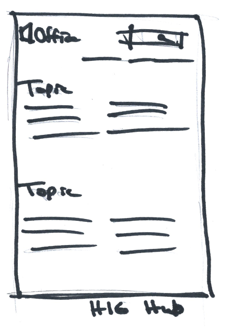
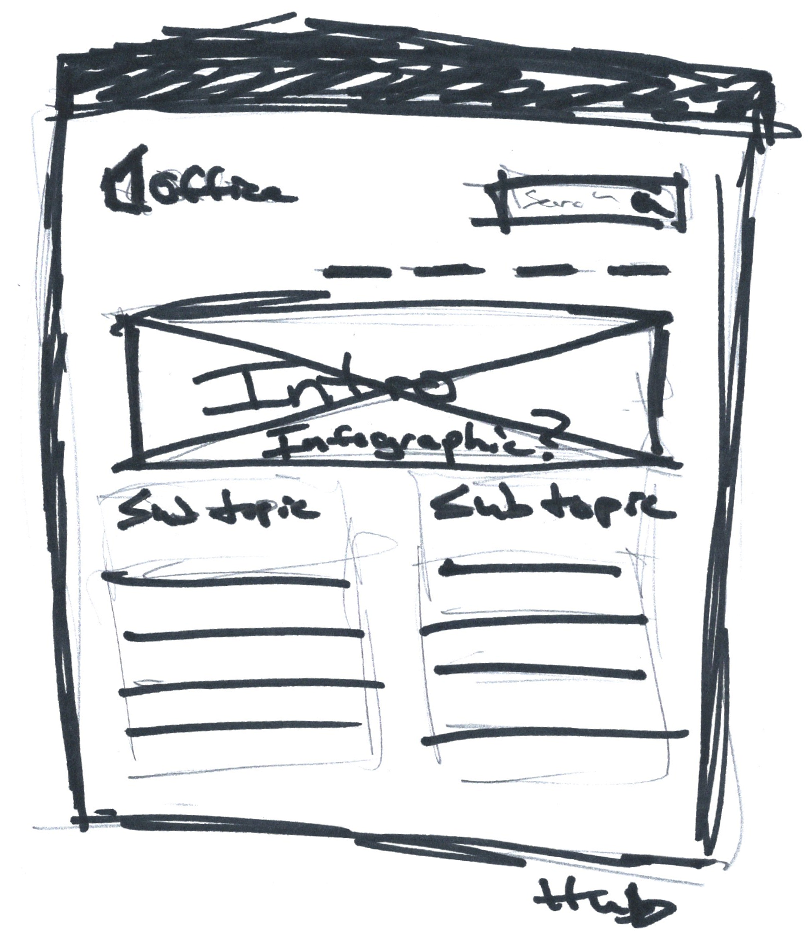
Basic Structure main hubs. Intro then links to each topic.
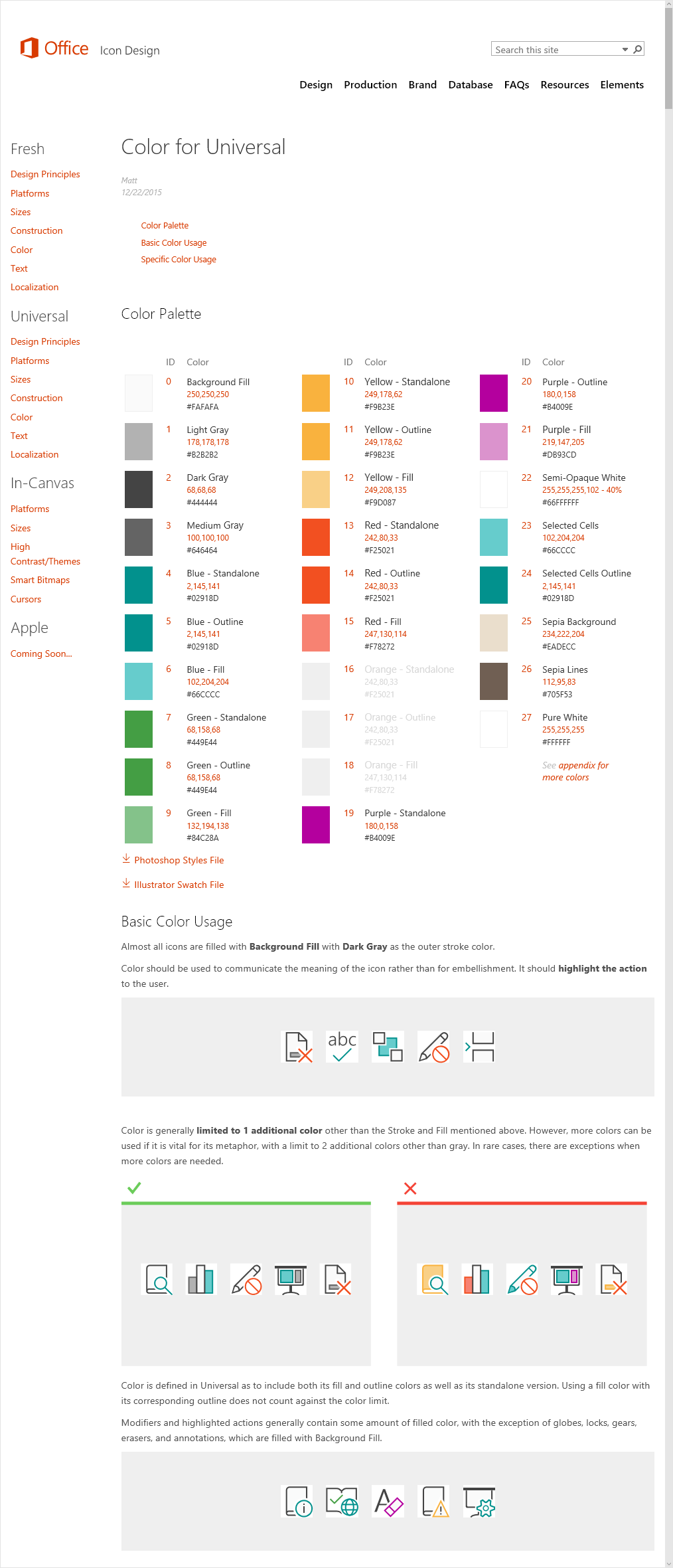
Use of simple graphics to make the whole thing easier to read
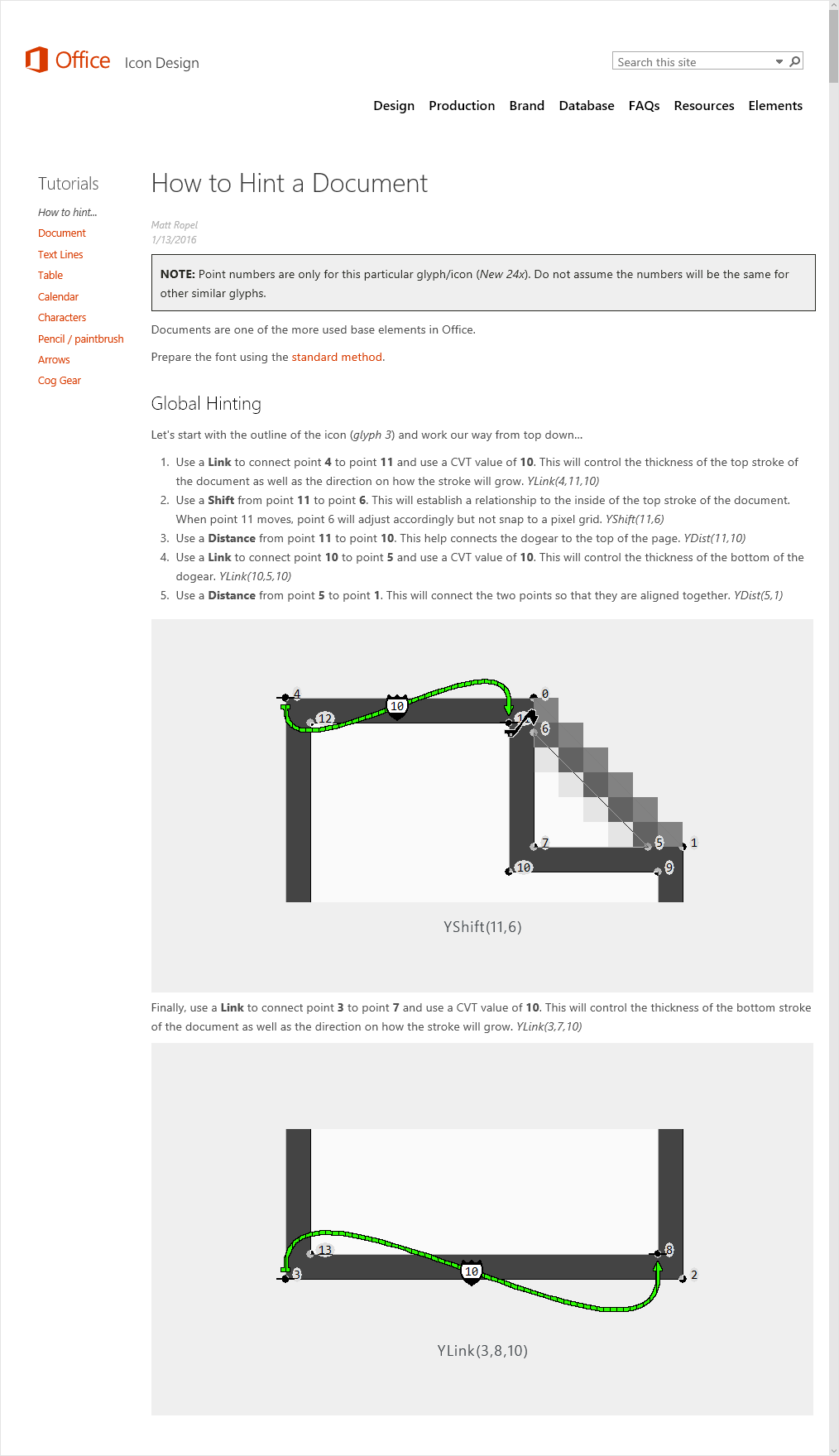
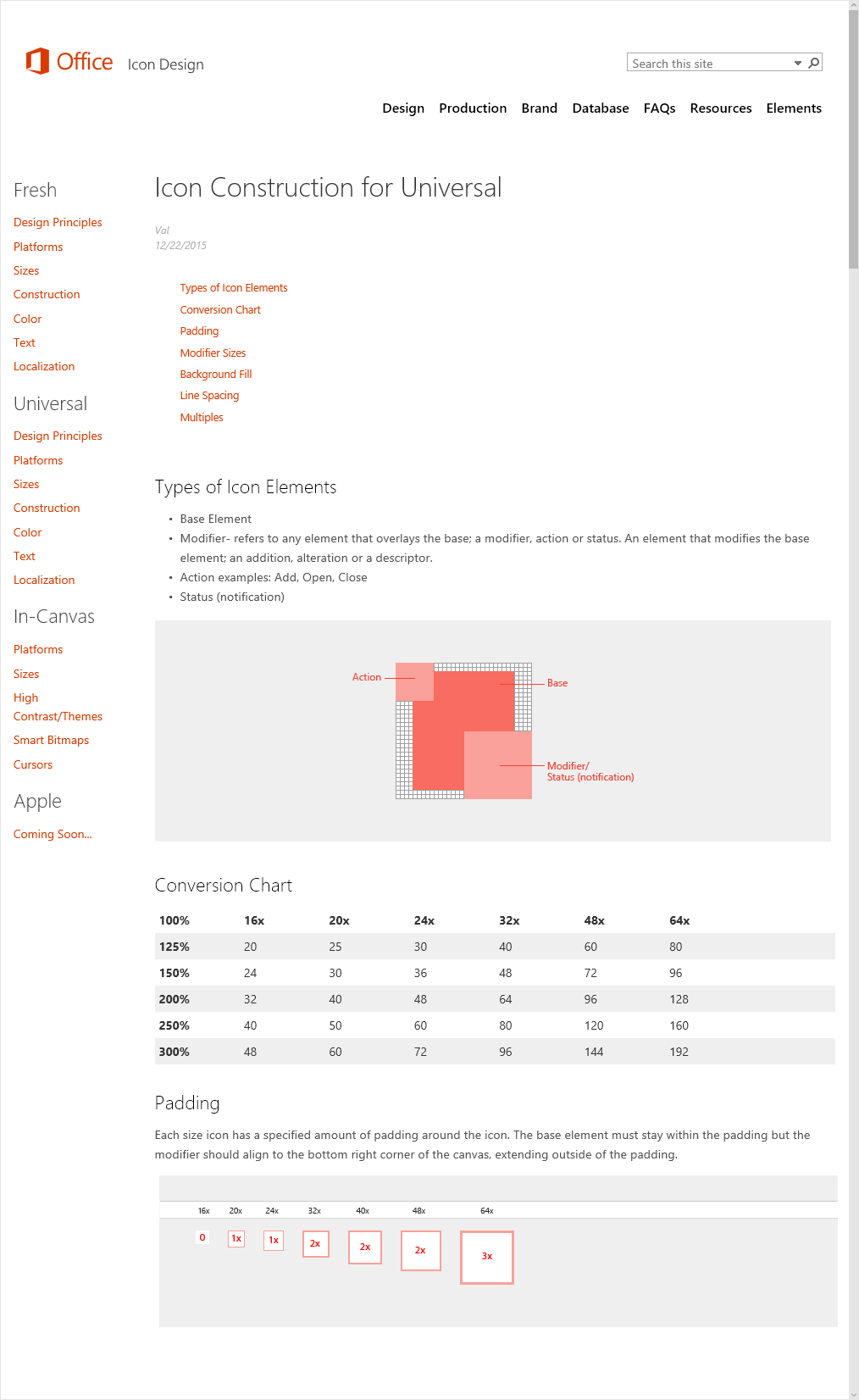
Sample of one of the tutorials.