Office Color Font + Hinting

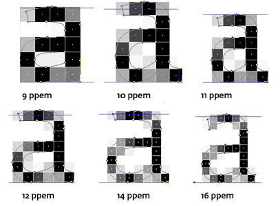
It’s become increasingly expensive to support multiple screen densities and platforms with traditional rasterized images. One approach that Microsoft has explored is the use of fonts using a technology created internally to layer colored glyphs creating colored vectored icons. Unlike other vector techniques, these fonts can retain sharpness through “hinting”.

Outcomes

1000's "fonts"
Official support of 6 DPIs
Developed a system that can be expanded in the years to come

Roles

Lead
Research
Trainer
Production

Timeframe

2014

A few terms…

I could write at length about the tech, history, and details about the color font technology, but this isn’t the place for it. However, there are a few terms that need to be expanded upon to make everything make sense.

Color Fonts?

Using a font as a delivery method for icons has been around for a long time. It's a tempting solution as it relies on a single small package that can be used universally on any surface. The graphics are vectored so they can be recolored and resized to fit ones needs. One issue has always been the lack of color. Apple helped change all of this with its the Emoji set created for the iOS text messaging app.

Microsoft developed a method introduced in Windows 8.1 using layered font glyphs that get colored through an XML color table. The advantages of the method are that it uses existing standards of font glyphs and layers. Plus, the advantages of using font hinting to retain sharpness.

1.B/W glyph used as a fallback
2. Yellow glyph
3. Black glyph

4. Blue glyph
5. Live rendering of the 3 color glyphs

Hinting?
Responsive design is for layouts what hinting is for type: controlling the surprises of scale. And designers prefer to be ignorant of both.Petr van Blokland

Hinting, or screen optimizing, is a series of instructions that adjusts the vectored outline to fit onto the rasterized grid of the screen. The process is meant to increase the readability on monitors. It's extremely important for low resolution screens and small sizes.

This all becomes useful to the artist/designer/typographer as it allows control and to maintain sharpness.

As a skill, hinting is very specialized. Most font foundries have their own tools, but the techniques are mainly the same. Microsoft has their own tool, Virtual TrueType, which is free to use.

Original outline of Fedra Sans Screen Regular, before rasterisation

Hinted version of Fedra Sans Screen, modifying the original outline to fit the grid of the computer screen.

Examples from Typotheque

Training

During the early planning phase of the project we were constantly told that hinting was too hard to learn and teach and we would need to rely outsourcing the task—an expensive proposal. All of this seemed ridiculous, so I took it myself to learn hinting.

I combed over 100’s of pages of documentation and decade old videos to summarized the information into a more palatable and updated format. The information was very dense and written from a developer’s perspective rather than designer's.

Simplified documentation was created, workshops and one-on-one sessions were used to help get my team up to speed. In the end, despite being told it would be too hard, I was able to get a team of over 8 designers to create and hint 1000 icons in a short period.

2-sided trifold cheat sheet for designers

Example of documentation

Examples

Below are examples of the hinting that was done for the font created for the original Android release. They are the 150% DPI icons hinting to retain a 1px stroke weight. The icons have been updated into the Office Universal icon style.