On a contract with the Office Design Group, I worked on the UX design for Microsoft Outlook 2010. Together with the other designers and researchers, I helped shape the look and feel of the popular application.
UX designer
Production
Design of Outlook
Production of redlines and assets
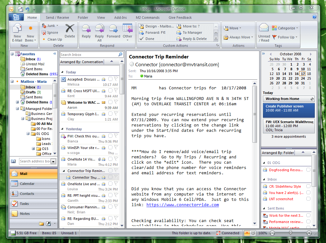
The early version was not too different from the earlier Office 2007 release. The main inclusion was the ribbon UI that was previously only on a few of the apps.
A lot of the focus on the initial designs was the flattening of the UI. The move to flatter and limited colors with little to no gradients was intended was to allow the users to focus on the content rather than superfluous elements.
Feedback from beta was that there was too much flattening and didn't feel contemporary. Slight gradients and effects were added to help give a more "polished" look.
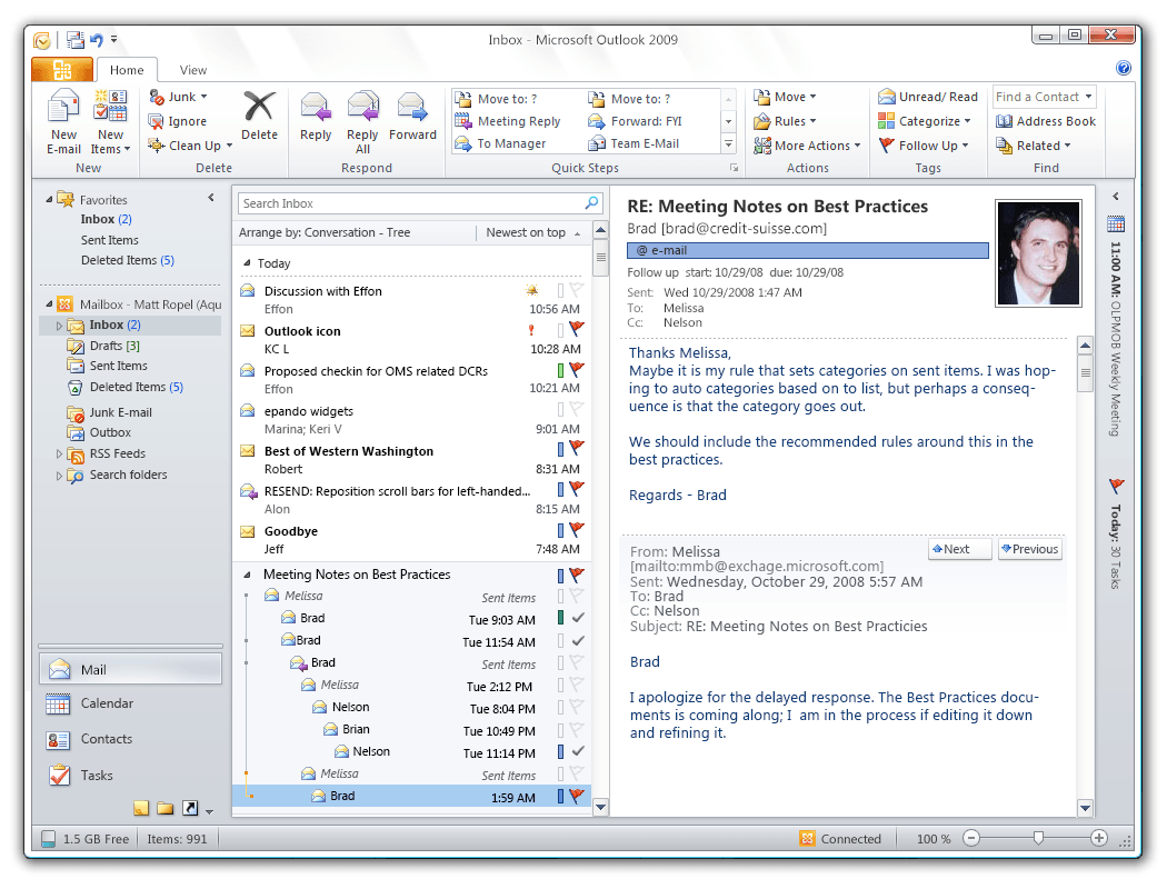
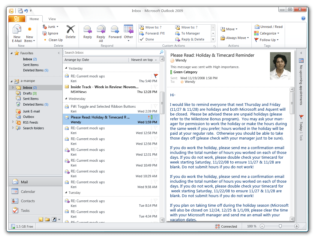
Mock up of the conversation view w/ the To-Do bar closed
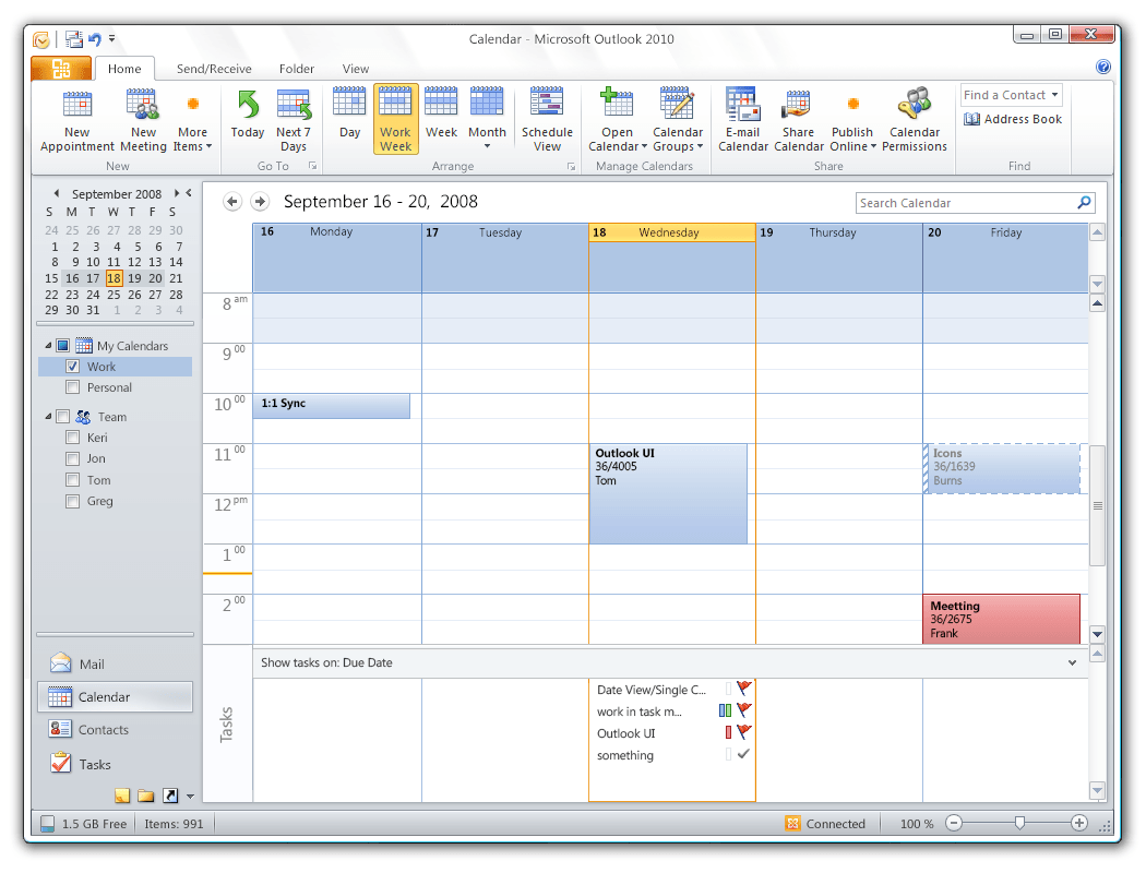
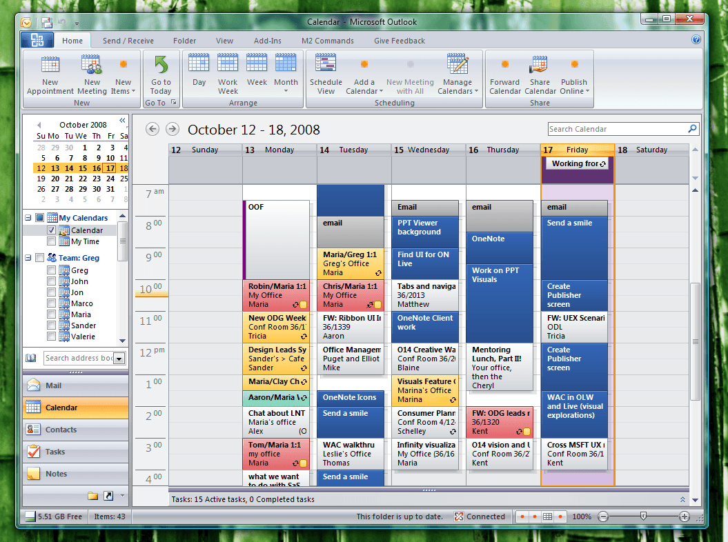
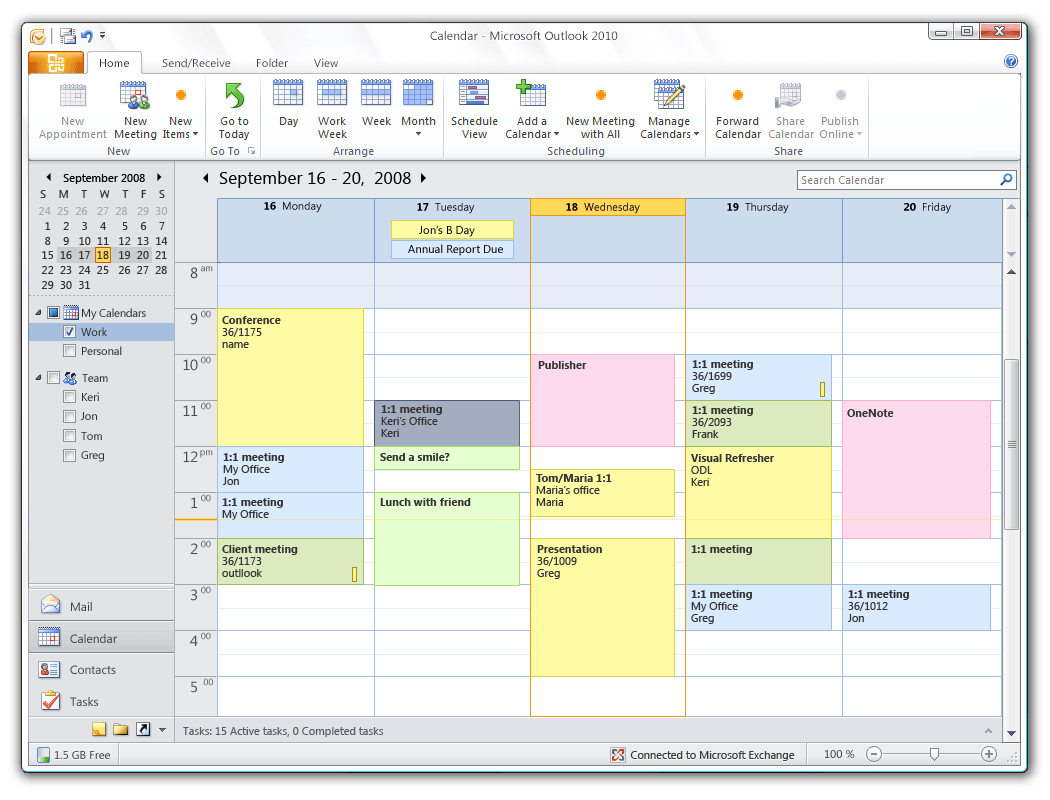
Mock up of the single calendar view
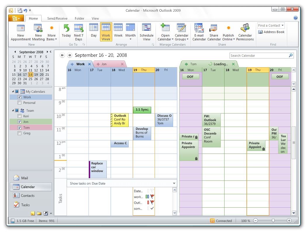
Mock up of the multiple calendar view
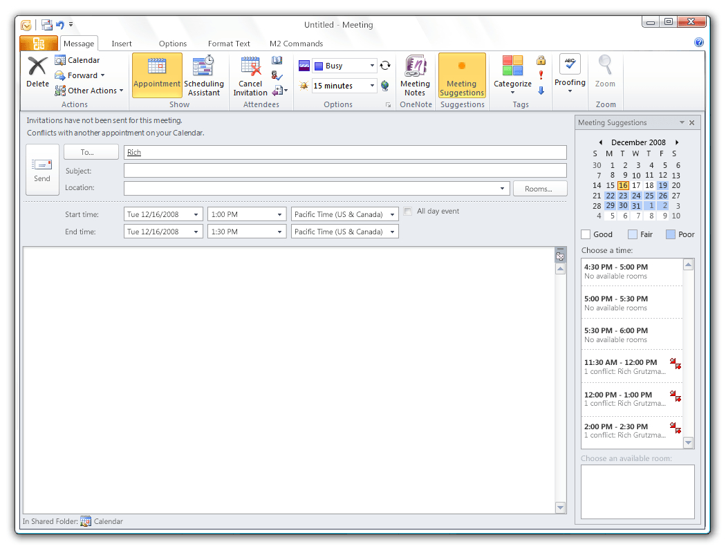
Mock up of the meeting request composer
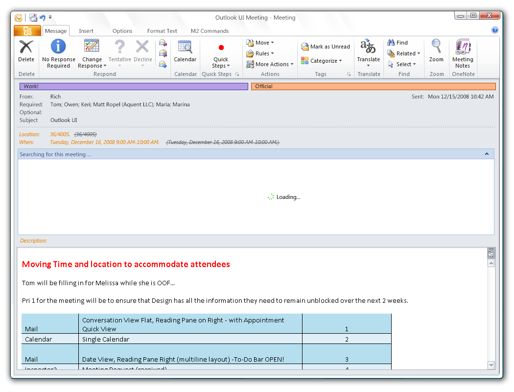
Mock up of the meeting request inspector