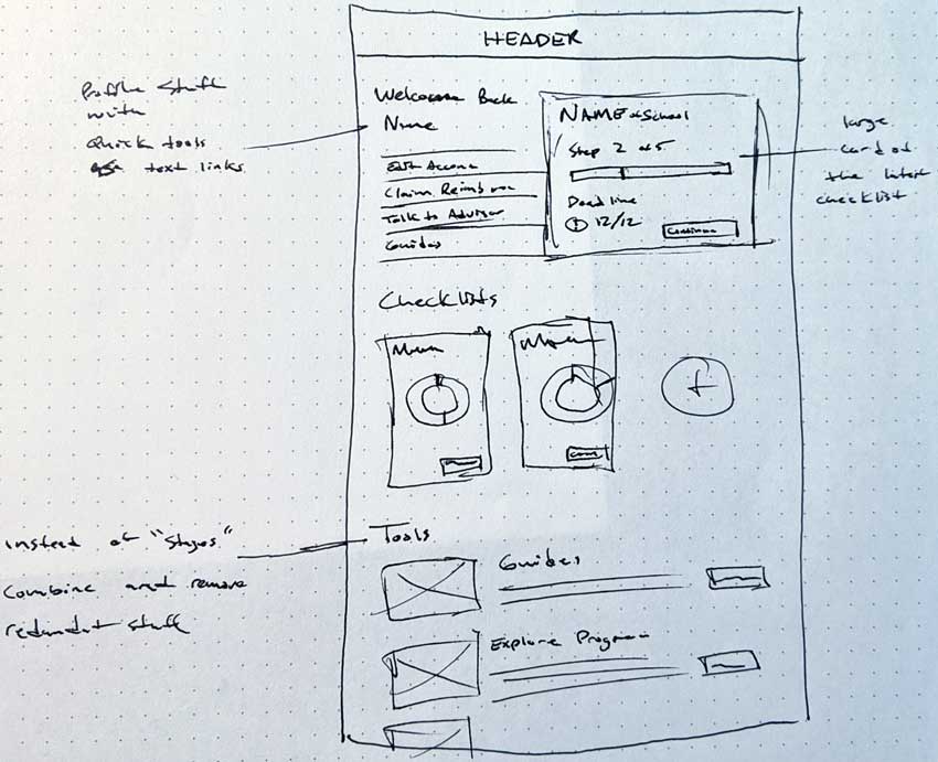
The TEACH.org Checklist 2.0 was the capstone project from the School of Visual Concepts UX certification program. It acts as a comprehensive test of all the lessons and classes before it. It allowed me to apply all aspects of UX design with a real client, solving a real problem. Along with two other designers, we tackled uncovering the user’s needs through various research methods, creating recommendations, and acting on them with a new vision on TEACH’s Checklist.
Outcomes
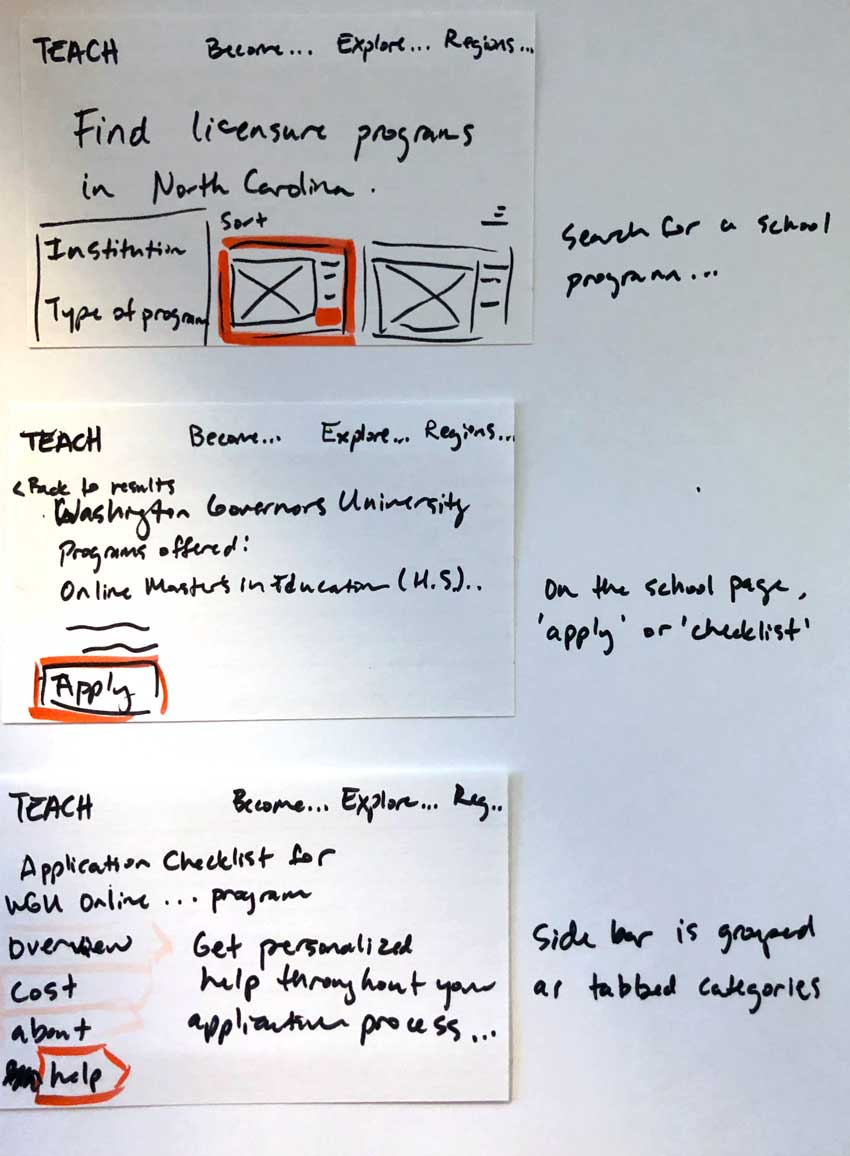
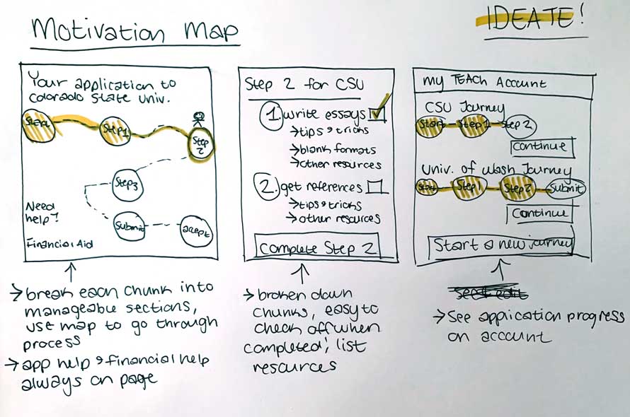
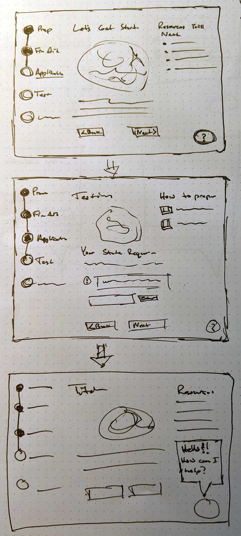
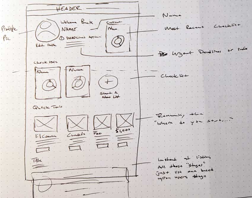
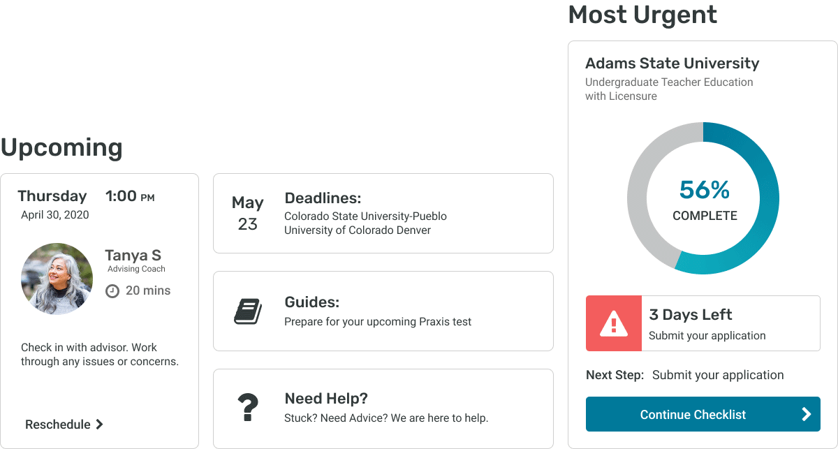
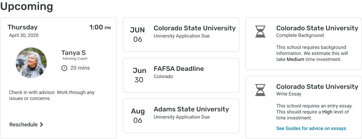
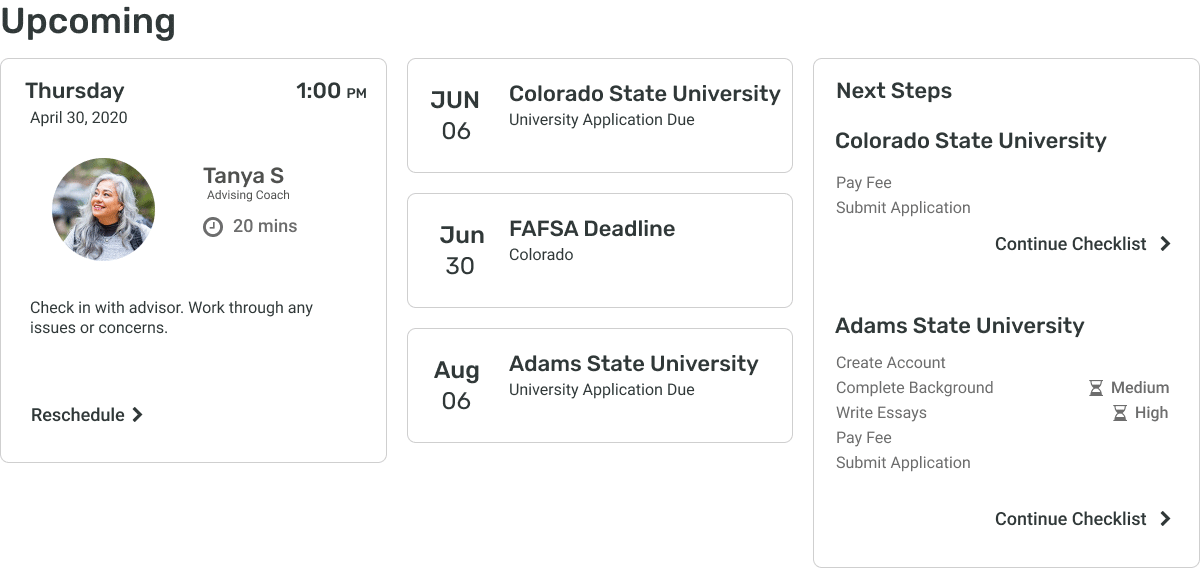
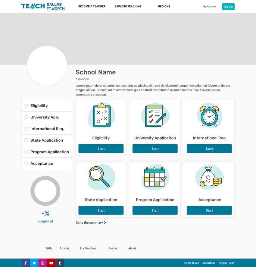
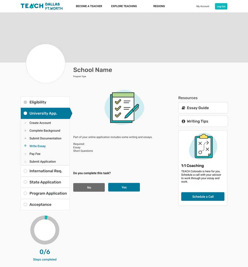
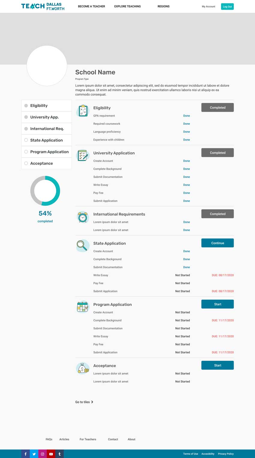
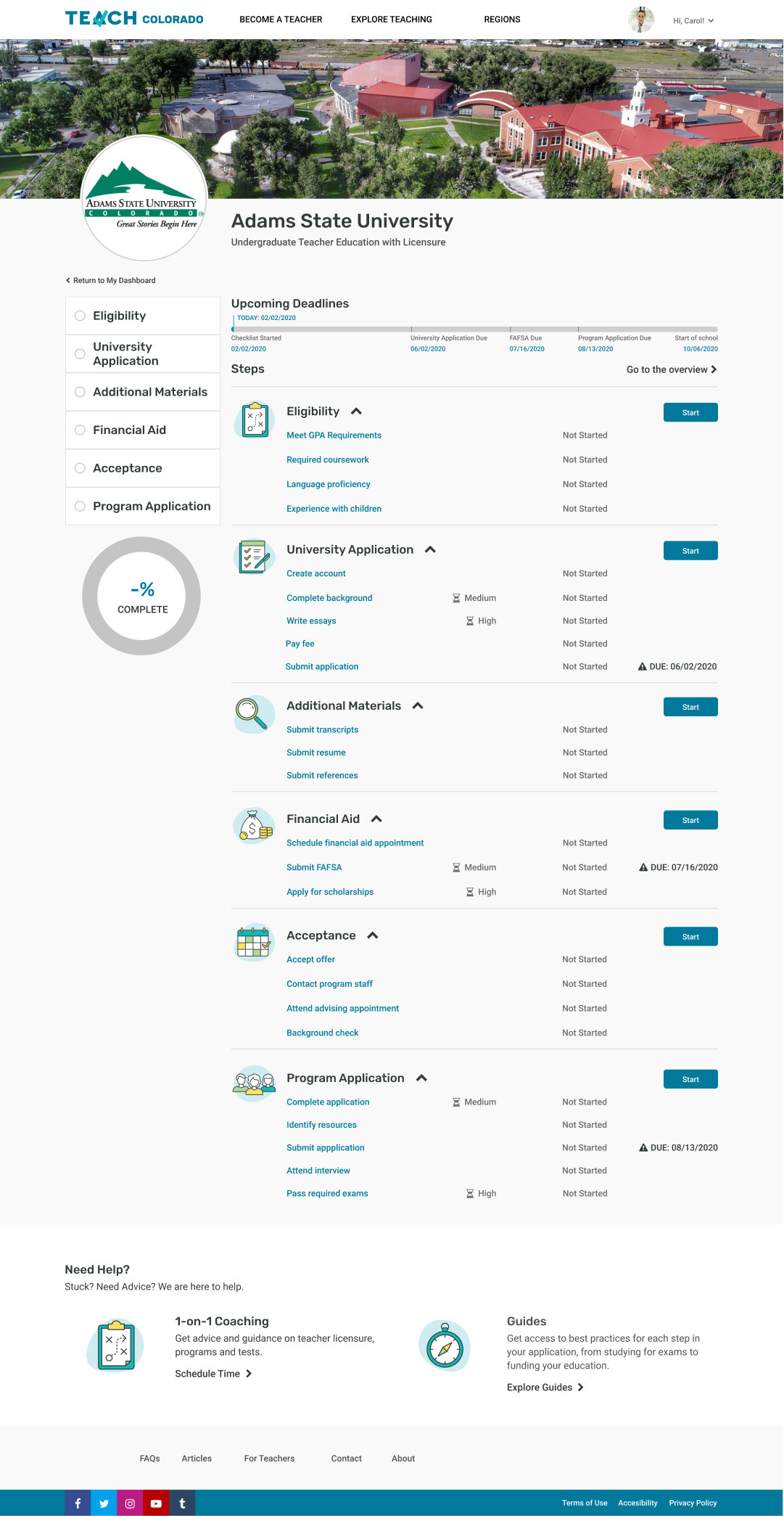
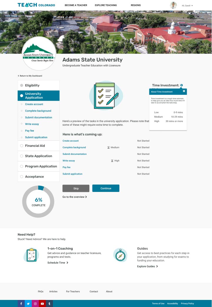
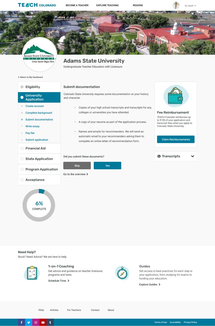
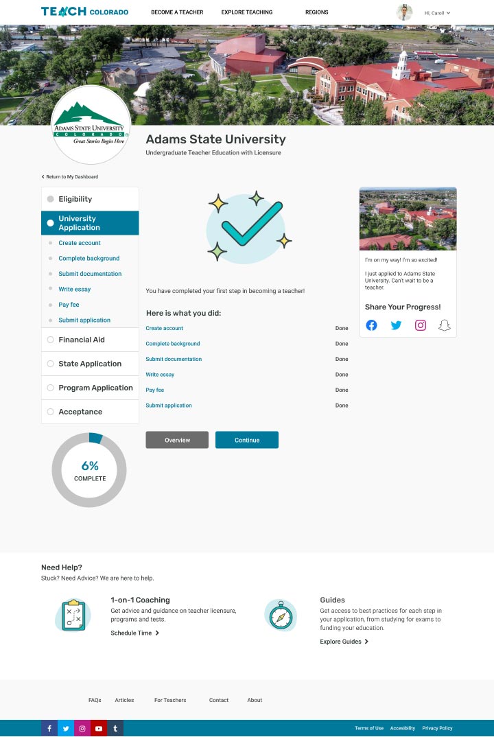
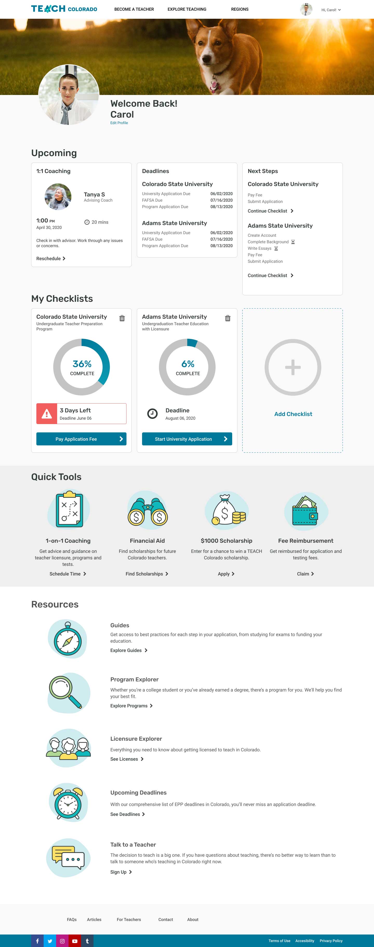
Redesigned Checklist
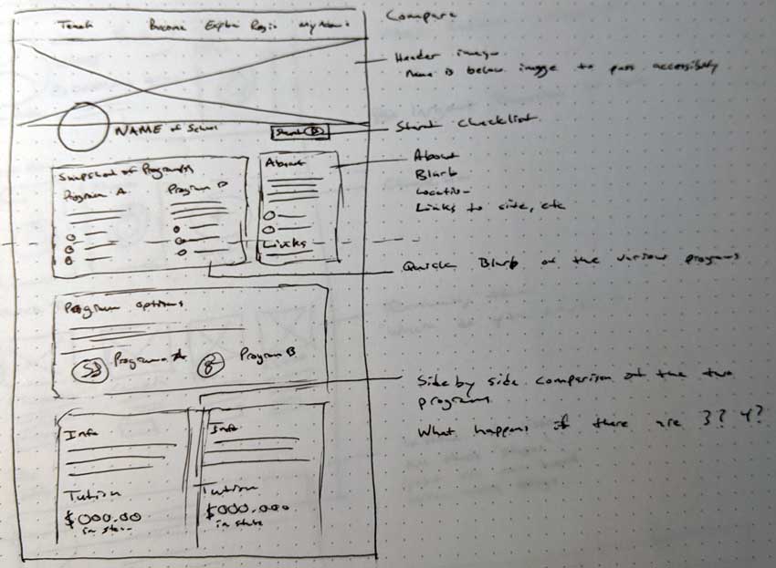
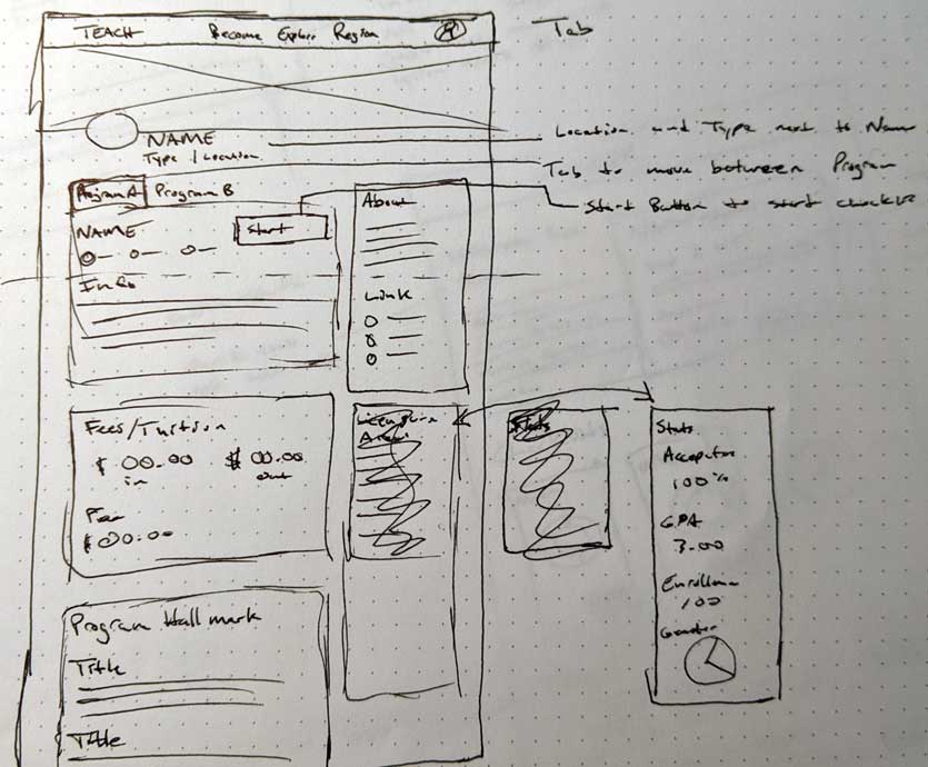
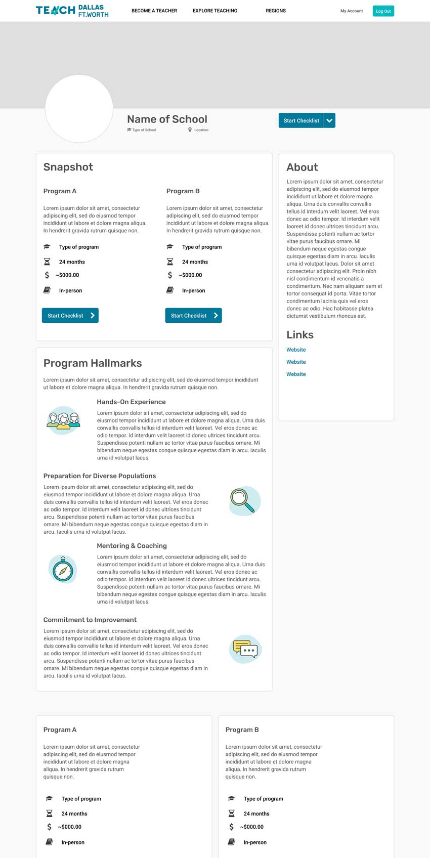
New Compare Experience
Improved SUS score - 91.25
Roles
Lillian Szugyi - Project Lead
Jenn Hicks - Research Lead
Matt Ropel - Design Lead
Research
Competitive Analysis
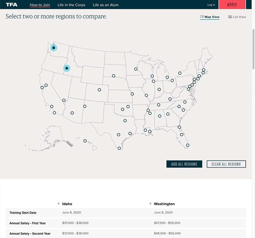
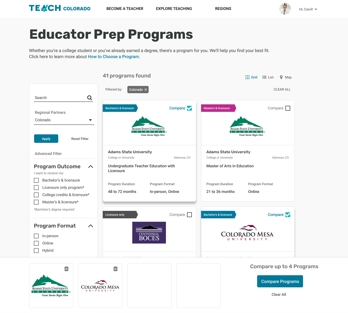
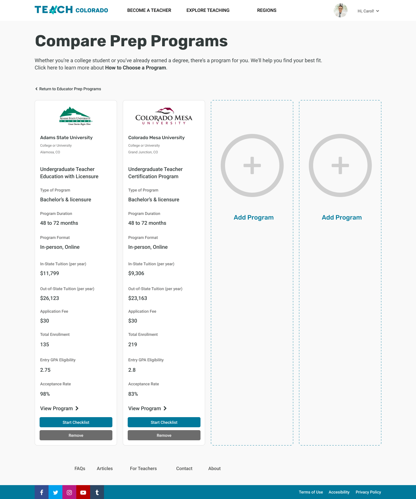
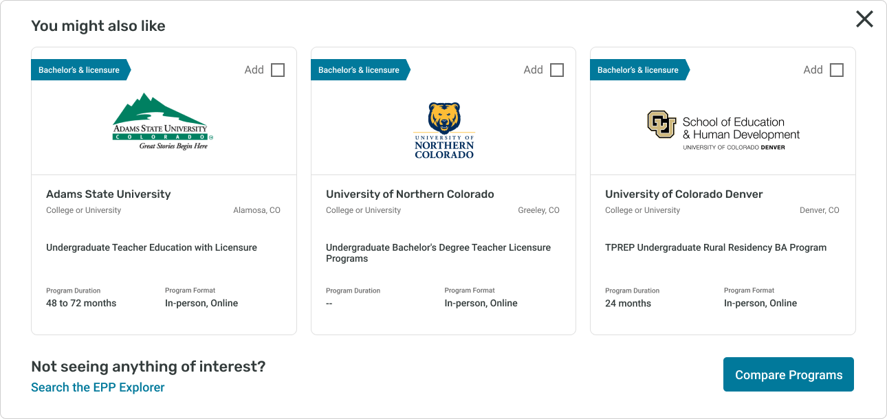
Teach for America empowers users with the ability to compare different programs
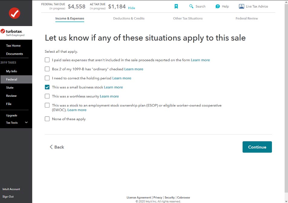
TurboTax steps users through the complicated process of taxes through a wizards
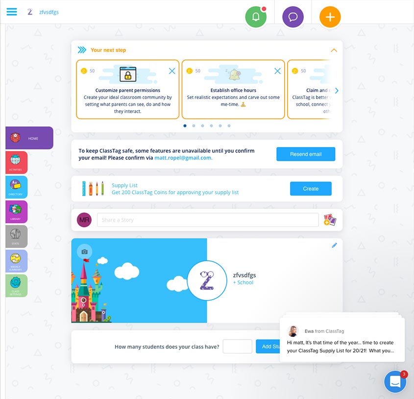
Classtag also uses wizards as well as engaging visual branding
We started our research by divide and conquering nine websites and products that were related or a direct competitor. The analysis gave us an idea of what the possibilities and risks are in this space. We noted our findings and shared them among ourselves. Ultimately what we felt there were several areas TEACH could improve.
Competitor websites have a way to compare different programs. Sites like Niche and Teach for America allow users to compare apples to apples of various products quickly.
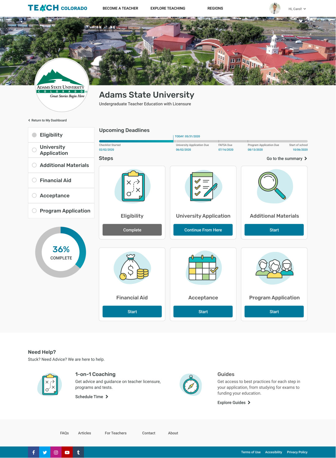
Wizards work well on guiding users through a process. Classtag has a first-run wizard that eases new users through the process of setting up a virtual class.
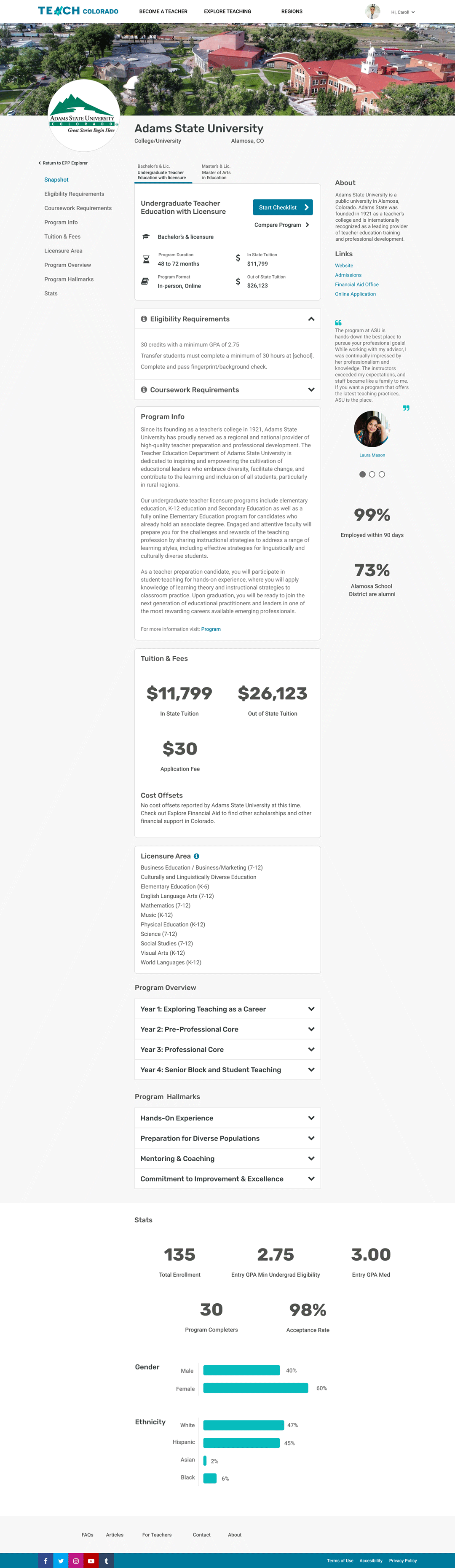
The process of applying to a program could be more engaging. A site like TurboTax takes something like taxes and break form input into a pleasant experience .
Resources were well-integrated into competitor flows.