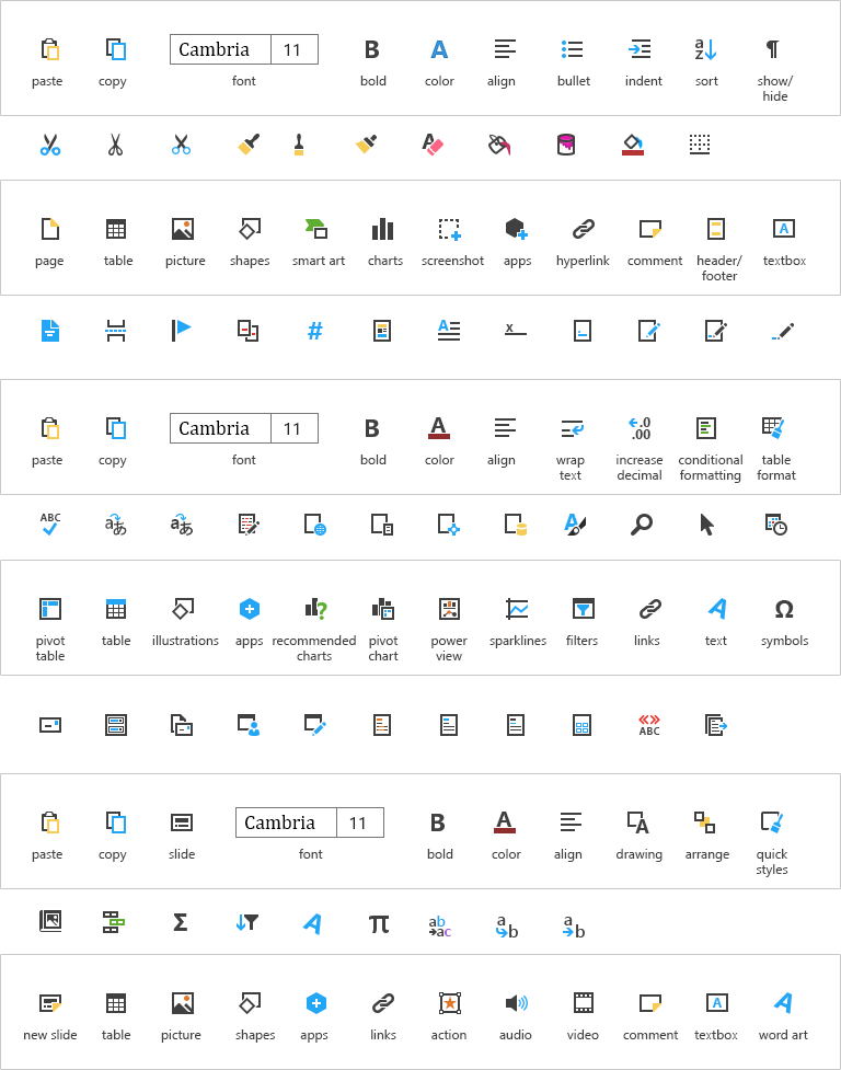
With Microsoft Office moving into a touch friendly direction with the release of the Office mobile apps, the icon style was redesigned to better align to a unified Microsoft style. The process was filled with many twists and turns. An early exploration looked into bolder and brighter design. This was canceled in favor of reusing the recently redesigned Office Fresh style. Later the redesign was brought back to life with the focus on aligning closer to Windows 10. The new icons rely on using the color font technology which allows better high DPI support along with theme support and accessibility
Outcomes
~1,000 icons in 8-10 weeks
redesign and simplification of existing metaphors
Creation and maintenance of a new icon font style for Microsoft Office
Timeframe
2015-2016
Currently still in product
Roles
Co-Lead
Technically advisor
Explored early design
Train and supervise 10 designers
Early Exporlation
Early exploration of the style was focused on creating something distinctly different then Office Fresh. The early versions of the Office Mobile apps used a bolder and brighter design which didn’t work well with the muted Fresh icons.
Old mock up of an Excel tab. The ribbon was aways in flux.

Old mock up of an Word tab.
Larger exploration of a style spread over multiple tabs and icons
In the end, the redesign was scrapped due to the design of Office shifting back to a more familiar direction.
Resurrection
With the release of Windows 10, the Windows team redesigned their icon style. For the first time, Microsoft would be releasing Office and Windows in the same time frame. This also meant that for Windows 10, Outlook would be upgraded to a 1st party application and become the default mail and calendar application. This led to the decision that Office would need to look again at redoing its icons to be more inline with Windows.
Here is a comparison of the two styles. Largely the two use similar metaphors.
Color Exploration
One of the benefits of using color fonts is the ability to easily apply and modify colors of thousands of icons with a single XML file.
Muted and desaturated fills.
High contrast between fill and stroke.
Low to no contrast between fill and stroke.
Non-primary colors. Teal for example replaced the blue.
Final
Use the slider to view the before and after